PRANAV
PRANAV
Vision with teeth.
Execution with style.

I am Pranav M. Narayanan, an entrepreneur, designer, strategist, and coach. As a T-Shaped Leader, I bring breadth across disciplines with deep expertise in design, operations and strategy — thriving at the intersection of creativity, ideas, and human potential.A polymath by nature and a builder at heart, I lead and move fluidly across disciplines to spark ideas, shape culture, and turn vision into momentum and lasting impact.
MY WORK
Below is the work I’ve had the privilege to create —
Ventures I’ve co-founded;
Brands I’ve (re)designed;
Experiences I’ve shaped;
Campaigns I’ve sharpened, and;
The beautiful game I’ve coached.Case studies. Designs. Stories. It’s all here.
And you didn’t land here by accident... So give it a thoughtful scroll through, and when something strikes a chord → double click!






Role
Co-Founder & Product Lead
Overview
Web 3, Music-Tech Platform | 2022–2025
The music industry has long undervalued creators, with artists earning fractions of a cent ($0.01) per stream while intermediaries capture most of the value. ADV3NT was founded to reimagine music ownership and monetization by combining Bitcoin Ordinals collectibles with DSP-style distribution — giving artists true control and fans tangible ownership.
My Role
As Co-Founder & Product Lead, I directed the product vision and execution from the ground up. Beyond the product, I also established ADV3NT’s visual identity and brand direction, designing the logo, defining typography and color palettes, and building a brand system that signaled both trust and innovation to artists and fans.
Challenges
Accessibility: Most fans don’t use wallets or understand Ordinals — onboarding had to be frictionless.Monetization: Artists needed a way to capture more value than traditional DSPs allow.Scalability: On-chain minting and payment flows had to be secure, reliable, and production-ready.Brand Trust: As an early player in Ordinals, ADV3NT needed a strong, modern identity to establish legitimacy.
Execution
• Secured $250K in pre-seed funding (friends & family round) to accelerate development of Beta 2.0.• Directed UX research with 40+ independent artists, shaping a dual product focus: collectibles + DSP distribution.• Designed hybrid payments system integrating Stripe and HD wallet generation to onboard both Web2 and Web3 users.• Engineered an atomic minting pipeline using PostgreSQL job queues, UTXO verification, and Supabase Edge Functions.• Created ADV3NT’s brand identity: logo design, typography selection, and visual system to ensure cross-platform consistency.• Negotiated a white-label DSP partnership, enabling hybrid monetization models.• Launched growth experiments on onboarding, referral flows, and retention metrics using Amplitude and Google Analytics.
Outcomes
• Built and deployed Beta 2.0 marketplace MVP with seamless fiat/crypto payments and atomic BTC inscriptions.• Designed a visual identity system now applied across the product, pitch decks, and events — reinforcing ADV3NT’s credibility as a next-generation music platform.• Secured first major artist drop with DJ Chuckie: 1,100 Ordinals projected to generate $429K–$450K in sales.• Established event partnerships with Nolcha Events (Bitcoin Nashville, Inscribing Nashville).• Positioned ADV3NT as an early innovator in Ordinals-powered music ownership.
Impact
ADV3NT showcases my ability to combine product strategy, technical execution, and brand design into one unified vision. I took the company from zero to a fully-funded, live product with a distinct identity and high-profile partnerships — proving my ability to both design the system and design the story.
Screens
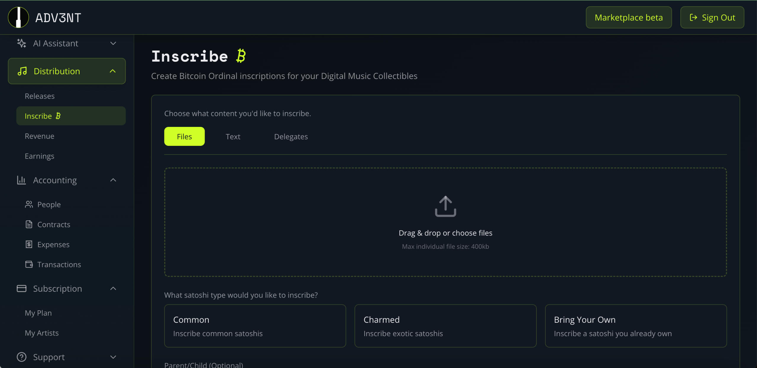
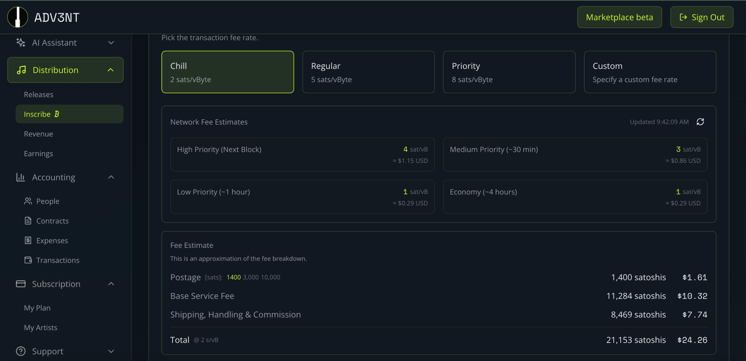
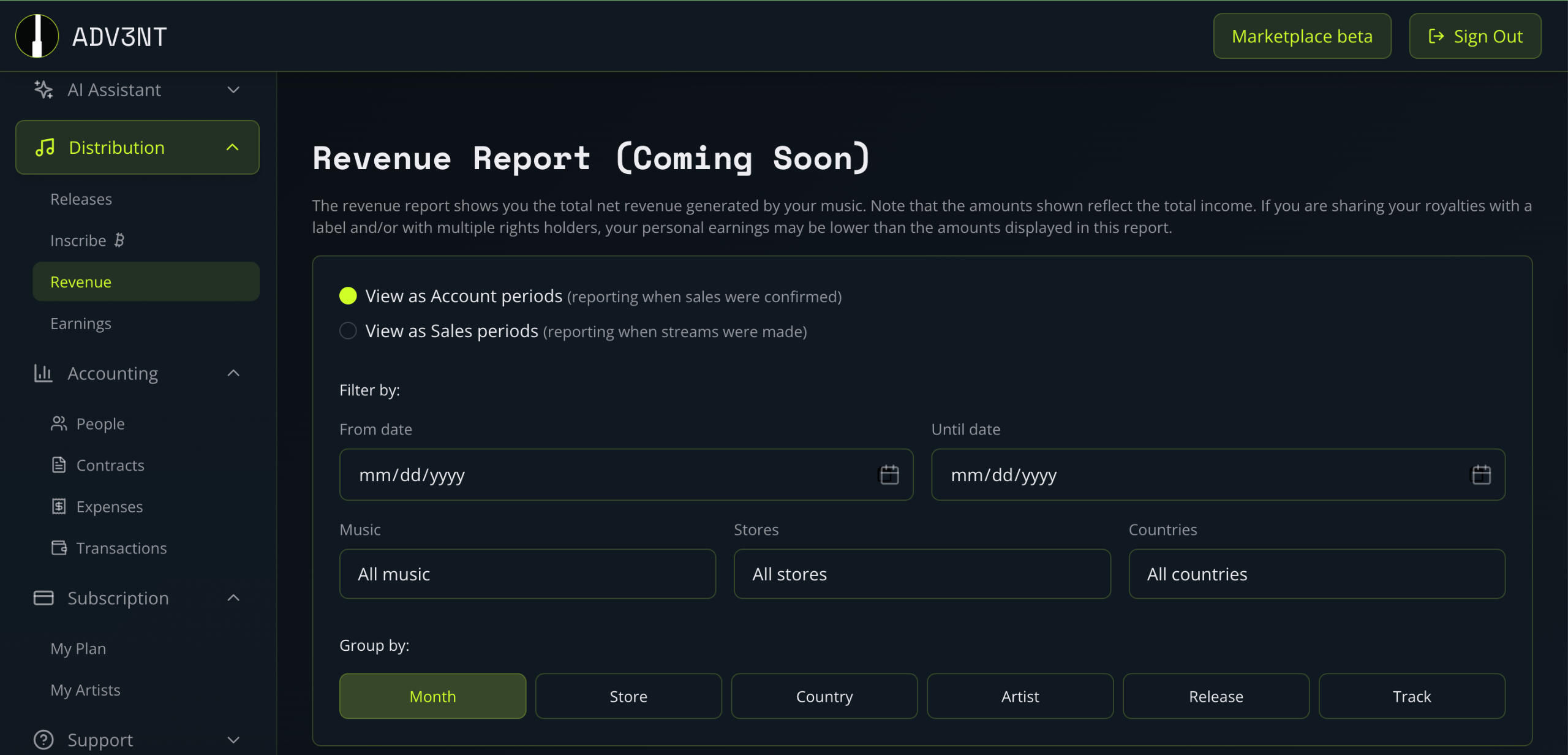
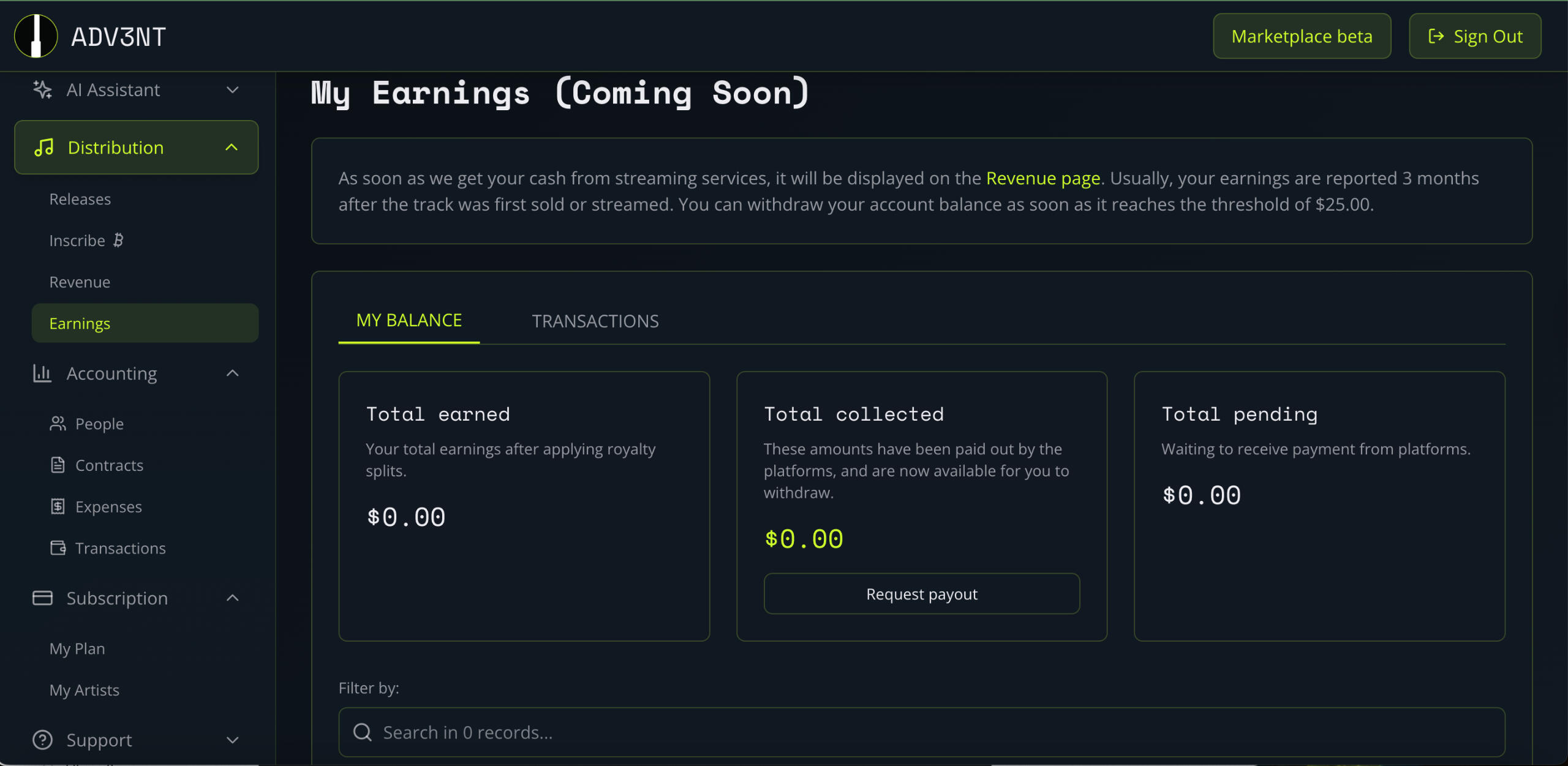
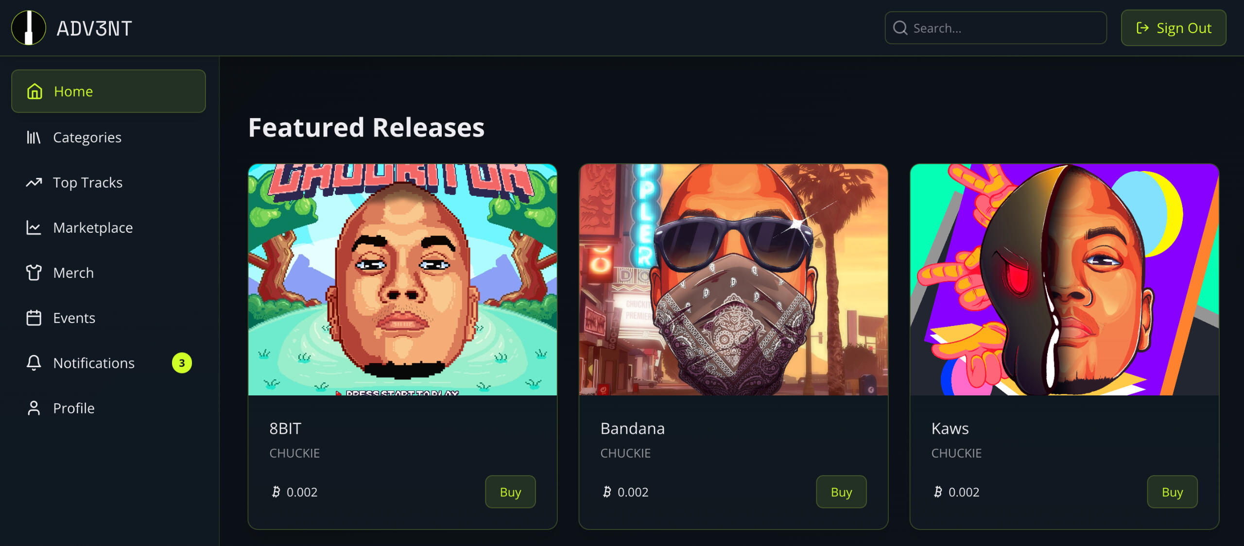
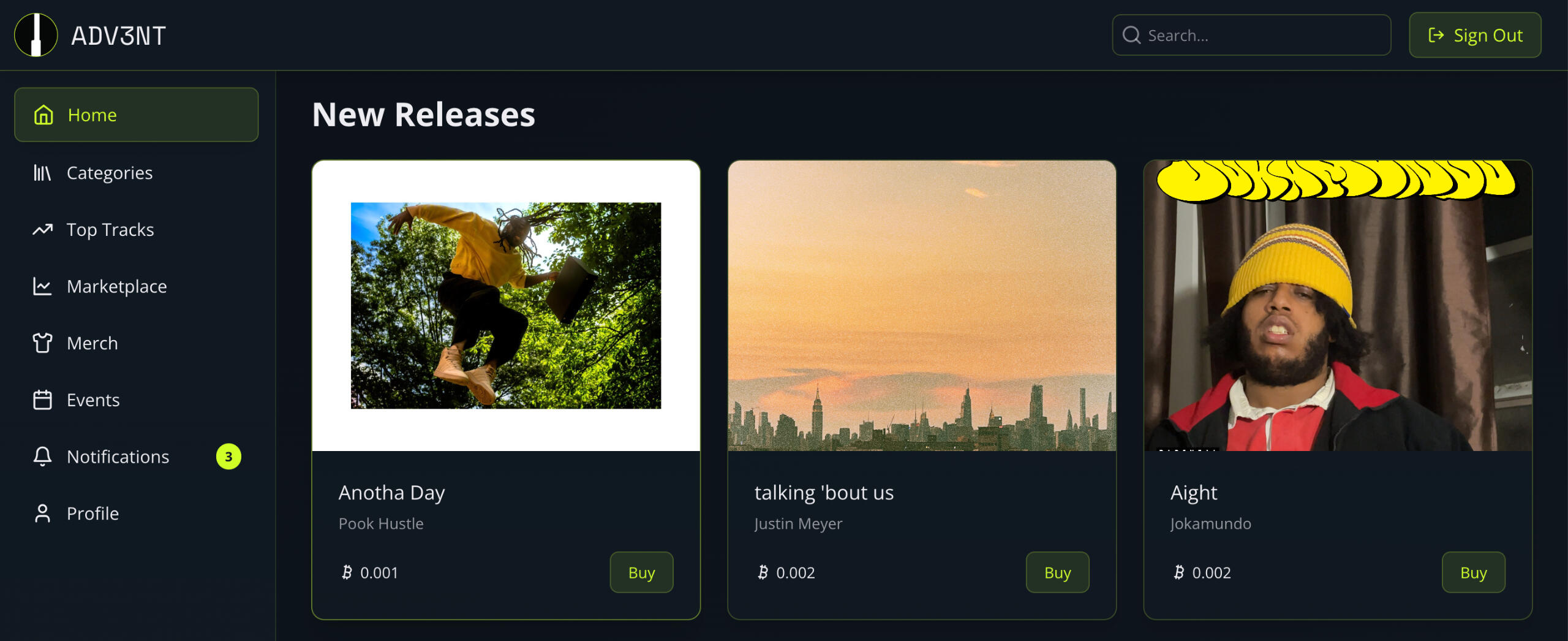
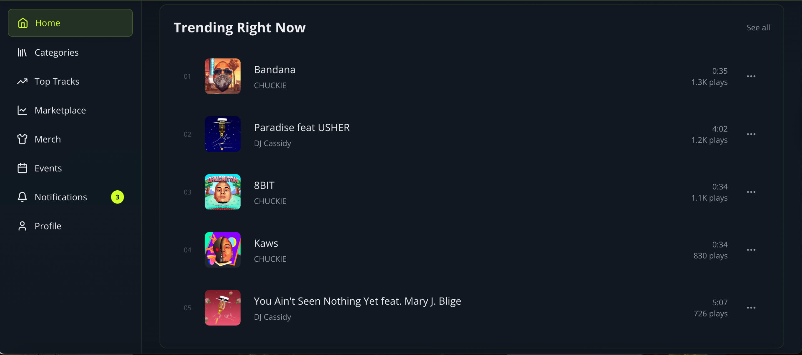
Content Creation

Roles
Senior Product Manager | '21-'22
UX Program Manager | '19-'21
UX Designer & Brand Strategist | '15-'19
Business Development Representative | '14-'15
UX Friction | Case Study
The Product
Digiwaxx is a music-marketing agency best known for its web-based record pool for DJs and record labels. For 20+ years, it has delivered high-fidelity music to DJs while providing artists and labels with metrics on how their releases were being used.With an active 60,000 DJs (≈3% of the global DJ market) and 10,000+ client-users (artists + labels), During my tenure with the company, Digiwaxx was a significant player in the industry.
The Problem
After a critical site migration in 2019, Digiwaxx’s attrition rate spiked to 33%, resulting in nearly 30,000 inactive users. Root causes included login/authentication issues, confusing new verification flows, a mandatory survey blocking downloads, and an outdated interface. This exposed a fundamental challenge: the user experience was no longer aligned with the expectations of DJs and artists, putting long-term retention at risk.
The Solution
We hypothesized that if we could remove friction points and accelerate DJs’ access to free music, we could lower attrition and rebuild user trust.
Team
CEO: Corey LlewellynProduct & UX: Pranav Narayanan, Benji BoutonFull Stack Development: Asaad Riaz, Satya Kala, Srini Unam
My Role
As Program Manager and UX Designer, I led the team through:• Discovery & Research — usability studies, surveys, and competitive benchmarking.• Ideation & Design — new user flows, wireframes, and prototypes.• Execution — partnering with our development team in India to validate and launch the new product.
Reimagining the User Flow
We restructured flows to serve two primary user groups: DJs and Artists. Our priority: faster, more intuitive access to music.
Wireframes & Prototypes
• Sketched → low-fidelity → high-fidelity prototypes.• Focus: simplify the download process, clean up the UI, and maintain an aesthetic that resonated with DJs.
BETA Launch & User Feedback
We launched a soft beta to a select group of DJs and conducted moderated usability studies.Key Findings:• Users rushed through the questionnaire to get free downloads → survey wasn’t adding value.• New interface was visually better but felt “too busy.”• Search icon (small magnifying glass) was overlooked → DJs frustrated they couldn’t search easily.• Sorting categories (“label,” “artist,” etc.) were confusing and unnecessary.
Iteration & Refinement
Using feedback, we:• Streamlined flows to reduce cognitive load.• Simplified the UI for clarity.• Prioritized search visibility and essential filters only.• Removed blockers (mandatory survey).This iterative process forced us to confront biases and design with true empathy for DJs’ needs in a competitive market.
Outcome & Impact
• Attrition rate reduced from 33% → 5% within 9 months.• Business development and customer-relations teams leveraged the new design to win back lapsed users who had moved to competitors.• Digiwaxx reestablished its reputation as a credible, DJ-first record pool with a modern, intuitive interface.
Key Takeaways
• Even with a strong user base, UX friction can erode trust fast.• Solving for speed + simplicity in DJ workflows was the unlock.• Design, research, and empathy led to measurable business impact: retention, reactivation, and renewed credibility.

Roles
Senior Product Manager | '21-'22
UX Program Manager | '19-'21
UX Designer & Brand Strategist | '15-'19
Business Development Representative | '14-'15
Spinworld Blog | Case Study
The Problem
The music industry lacked an equitable, centralized ledger where DJs, radio segments, artists, and fans could track which DJs and mixshows were breaking new artists in real time.Mainstream platforms (Billboard, Genius, Rolling Stone) catered to mass audiences, while industry professionals — DJs, managers, label reps, promoters — were left to scour fragmented sources for credible insights on emerging records and tastemakers.
The Solution
We set out to design Spinworld Blog, Digiwaxx’s dedicated news and insights hub for the DJ and mixshow community. The goal was to create a well-organized, user-friendly platform that highlighted DJs and radio segments, filled the information gap, and gave industry personnel a reliable source for discovering who was championing new records.
Team
CEO: Corey LlewellynSenior Product Manager & UX: Pranav NarayananUX Design: Ranjith NairFull-Stack Development: Asaad RiazMarketing: Kawani Brown, Will Gordon, Earl Powell, Erica Harrison
My Role
As Senior Product Manager, I led the team through:• Discovery & Research — usability studies, surveys, and competitive benchmarking.• Ideation & Design — new user flows, wireframes, and prototypes.• Execution — partnering with our development team in India to validate and launch the new product.
Process
1. Heuristic Evaluation
Reviewed the existing blog theme for usability gaps. Key criteria included visibility of system status, consistency, error prevention, minimalist design, and efficiency of use. Findings informed our redesign roadmap.2. Information Architecture & User Flow
Organized content structure into a clear site flow, ensuring users could easily navigate between DJ features, news updates, and record spotlights.3. Wireframes & Prototyping
Developed low-fidelity wireframes to validate structure and flow with stakeholders, followed by high-fidelity prototypes with emphasis on simplicity, readability, and white space.4. High-Fidelity Design
Applied a clean, modern UI with typography choices that balanced authority and approachability. Prototypes were created to visualize the blog’s long-term design vision.
Outcome
Delivered a validated site flow and high-fidelity prototypes ready for development.Established a blog design that balanced industry credibility with readability.Provided Digiwaxx with a framework to spotlight DJs and mixshows in a way mainstream platforms had overlooked.
Key Takeaways
Development was postponed due to limited financial resources, but the design remains a novel solution to an unmet industry need.Next steps would include:• user testing,
• feedback collection,
• and iterative design before relaunch.This project reinforced the importance of white space, information hierarchy, and content-first design in making industry news platforms engaging and usable.

FERRY
Rewards-based mobile app for restaurants, salons, and local services.
Role
UX Designer Freelance
Loyalty Points | Case Study
The Problem
Customers who regularly visited restaurants, salons, and other businesses didn’t feel valued for their loyalty. Without rewards, they often defaulted to quicker alternatives like delivery apps or competitors.👉 The question: How might we reward loyalty and create incentives for customers to return to businesses?
The Solution
So we designed Ferry, a mobile app that:• Rewards users based on visits, spending, and first-time check-ins.• Helps users discover local offers and promotions.• Provides direct engagement features (call, GPS, map, directions).• Serves as a loyalty and retention tool for businesses beyond food — salons, futsal arenas, entertainment outlets, etc.
My Role
As a UX Designer, I collaborated closely with engineers and the CEO throughout:Research: Competitive analysis, user interviews, opportunity mapping.Design: Brainstorming, wireframes, high-fidelity designs, prototypes.Iteration: Usability testing, refining onboarding, simplifying flows.Delivery: Partnered with Android/iOS engineers to launch and test beta releases.
Approach
1. Research & Insights• Competitors (e.g., Groupon) encouraged “deal hunters” rather than loyal customers.• Users wanted rewards not only for restaurants but also salons and other recurring experiences.• Loyalty was already present (e.g., people sticking with the same salon for years) but rarely recognized.-------------------------------------------------2. Design & Prototyping• Explored NFC/Ultrasound for auto-validation, but pivoted to a more feasible 4-digit alphanumeric code for check-ins.• Core features: loyalty cards, curated offers, discovery by location, subscriptions to favorite outlets.• Sketched wireframes → low-fi → high-fi prototypes.-------------------------------------------------3. Beta Launch & Feedback• Soft-launched at Slate Hotels (two F&B outlets). Key feedback:• Users wanted price ranges and more prominent search.• Loyalty card progress should be visible upfront.• Validation details needed to be easier to find.• Onboarding was too slow (manual OTP input) → redesigned to be simpler.-------------------------------------------------4. Iteration & Evolution• Shifted focus to Loyalty Cards (user-preferred) → introduced Instant Rewards and Spend Meters with gamified tiers.• Removed underused “Posts & Products” feature (overlap with Instagram/Facebook).• Reorganized navigation into Rewards / Discovery / Profile, streamlining user journeys.
Outcomes
• Created a reward-first app experience that better addressed user needs and business goals.• Improved retention by focusing on loyalty programs rather than cluttered content.• Increased app engagement and downloads post-restructure.• Partner businesses gained a clearer value proposition: a tool that encourages repeat visits and customer loyalty.
Key Takeaways
• Users wanted rewards made simple, visible, and fun.• Businesses wanted a clear retention tool, not another social posting platform.• Ferry’s evolution (loyalty cards → instant rewards → gamification) reflected true user-centered iteration.

FERRY
Rewards-based mobile app for restaurants, salons, and local services.
Role
UX Designer Freelance
Business Dashboard | Case Study
The Problem
Businesses lacked an effective way to track and validate their regular customers. Loyalty was often invisible: managers and staff rarely recognized regulars, customers felt undervalued, and retention suffered.
The Solution
We designed Ferry Dashboard, a business-facing platform that:• Enabled outlets to validate and reward customers.• Tracked spending and visits in real time.• Provided analytics and performance data for owners to assess outlets and staff.• Simplified loyalty program management beyond physical cards or disjointed apps.
My Role
As a UI/UX Designer, I:• Led research, wireframing, high-fidelity design, and prototyping.• Facilitated brainstorming sessions with our small team to translate business pain points into actionable features.• Worked closely with engineers to ensure usability and design standards.• Iterated designs based on feedback from both business owners and staff during beta launches.
Approach
1. Research & Discovery• Competitive analysis of Groupon, Nearbuy, Hashtag Loyalty.• Interviews with business owners revealed key insights:• Social media posts were easily drowned out by noise.• “Deal hunters” often redeemed one-time offers and never returned.• Physical loyalty cards caused issues (loss, fraud, disinterest).• Owners wanted retention tools, but existing programs were too complex or limited.2. Ideation & Wireframes• Defined core features: loyalty validation, spend tracking, analytics, outlet info, and curated offers.••• Sketched flows → built low-fidelity wireframes → stakeholder approval.3. Beta Launch (Slate Hotels, Studio & AYR)• Staff found the mobile dashboard overwhelming and difficult to use at first.• Customers resisted downloading another app, but were motivated by rewards.• Staff needed guides, FAQs, and a more streamlined flow to feel comfortable.4. Iterations• Reduced clutter → removed unused “posts & products” features.• Phone number validation → replaced app download requirement, making onboarding seamless.• Streamlined redeem flow → simplified to show only relevant active rewards, reducing staff error.• UI refinements → blacked out home screen to improve focus on key elements.5. Vertical Testing• Expanded into salons, entertainment venues, and kiosk restaurants.• Adjusted flows for staff familiarity and vertical-specific needs.
Outcomes
• Businesses reported improved customer retention by rewarding and tracking regulars.• 60% of test businesses noted an increase in returning customers.• Staff found the simplified flows easier to manage, especially with phone number validation.• The platform evolved into a reward-first system that was more valuable and usable than competitors.
Key Takeaways
• Loyalty programs succeed when they are frictionless for both staff and customers.• Simplicity beats feature overload — removing unused features improved adoption.• Iteration with real-world business input was crucial to designing a platform that worked across verticals.• Future vision included a Lite version of the dashboard (focused only on redeem flows) and custom push notifications for more personalized loyalty campaigns.

The Story
In 2010, my grandfather, Narayanan Kartha, suffered a fall during a leisurely walk from his home garden to the patio, which fractured his hip. The aftermath was devastating: rapid muscle decline, sarcopenia, and eventually dementia. Watching his health deteriorate so quickly left an indelible mark on me and my father, Dr. Padmakumar Narayanan — a toxicologist and mitochondrial expert with over 40 years of experience in scientific research and clinical development.After my grandfather passed away in 2018, my father and I began to imagine what could have been different.What if we could create a therapeutic and nutraceutical platform that not only slowed muscle decline but enhanced vitality and longevity?What if families like ours didn’t have to watch their loved ones fade after one accident or injury?From those questions, CelaMza was born.
Building from a Vision
What started as a personal story has since become a company with real potential to transform lives. By 2024, we formally incorporated CelaMza and began building a foundation for scale. My role as Founder has been to take the deep scientific genius of my father and translate it into a company with vision, clarity, and operational rigor.• I spearheaded the intellectual property strategy, securing a provisional patent for our ASO therapeutic platform and locking down a critical know-how license from Ionis Pharmaceuticals.• I designed the strategic business model, shaping a hybrid B2C/B2B2C approach to commercialize both a nutraceutical product line and a therapeutic pipeline targeting sarcopenia and rare diseases.• I directed investor readiness, building financial models projecting $62M in Year 5 revenue, 70% margins, and investor returns exceeding 100% IRR.• I crafted investor decks and messaging, making complex science understandable to both investors and strategic partners.• I defined the product strategy and market positioning, establishing a dual-pipeline approach to target immediate market entry via nutraceuticals and longer-term therapeutic breakthroughs.• I negotiated legal and business development deals, including our exclusive Ionis license, ensuring CelaMza has a defensible moat from day one.• I designed the brand and website (celamza.com), communicating the promise of our vision to both investors and potential partners.
Where We Are Now
Today, CelaMza is pre-seed stage, currently raising a friends & family round. We’ve already established our IP position, secured exclusive licenses, and designed a scalable business model. Our dual-pronged approach — nutraceutical and therapeutic — positions us to capture the longevity, anti-aging and sarcopenia markets, and pioneer treatments in rare diseases.
Heart of CelaMza
At its core, CelaMza began with my grandfather’s story and my father’s science. My role has been to build the foundation that allows that science to take shape in the real world — from operations and branding to legal and investor strategy.CelaMza reminds me why I do this work: to take ideas with human impact and give them the structure to thrive. It is the fusion of science, design, and execution — rooted in family, driven by purpose.
Designing Systems of Play & Community Building in New York City
Sporting & Community Director | Mar '24 - May '25
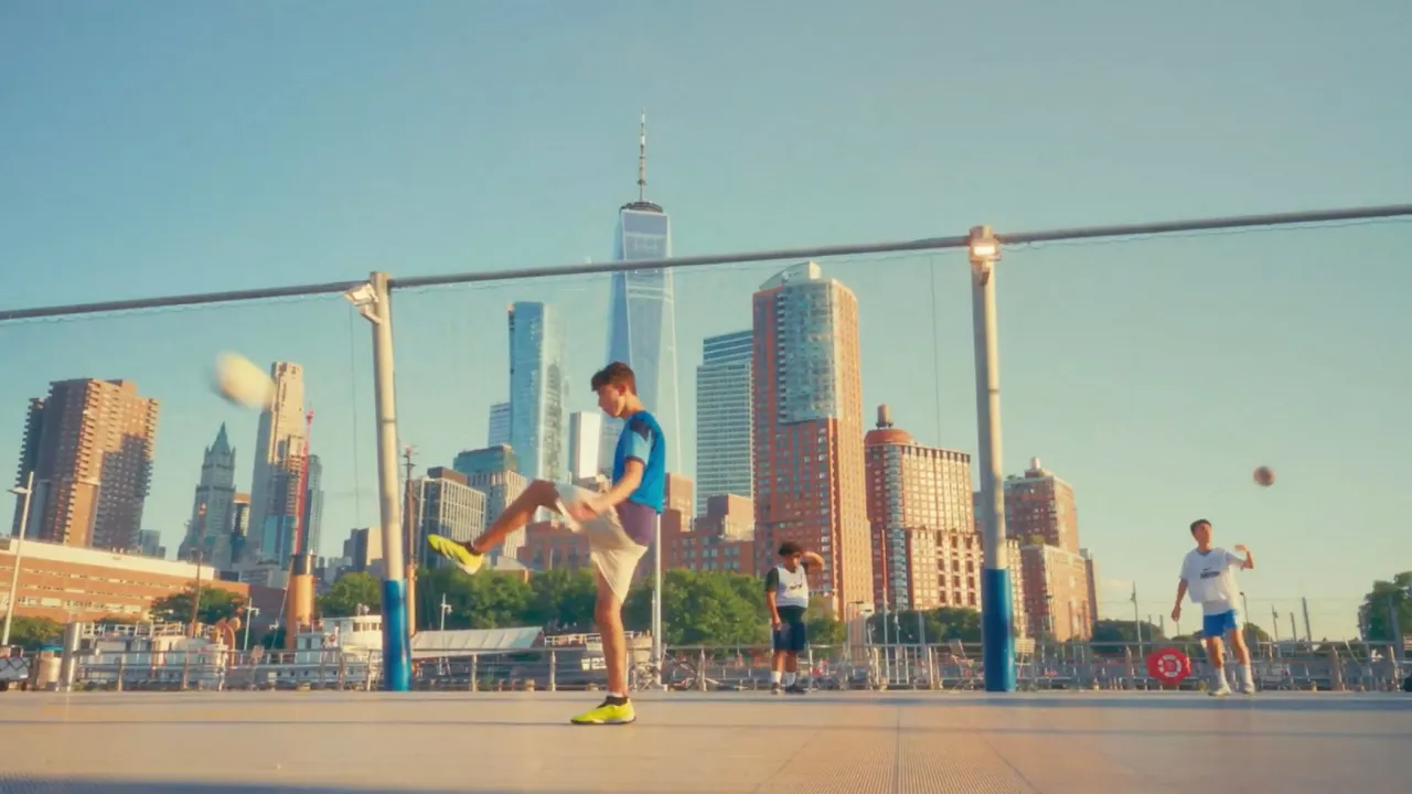
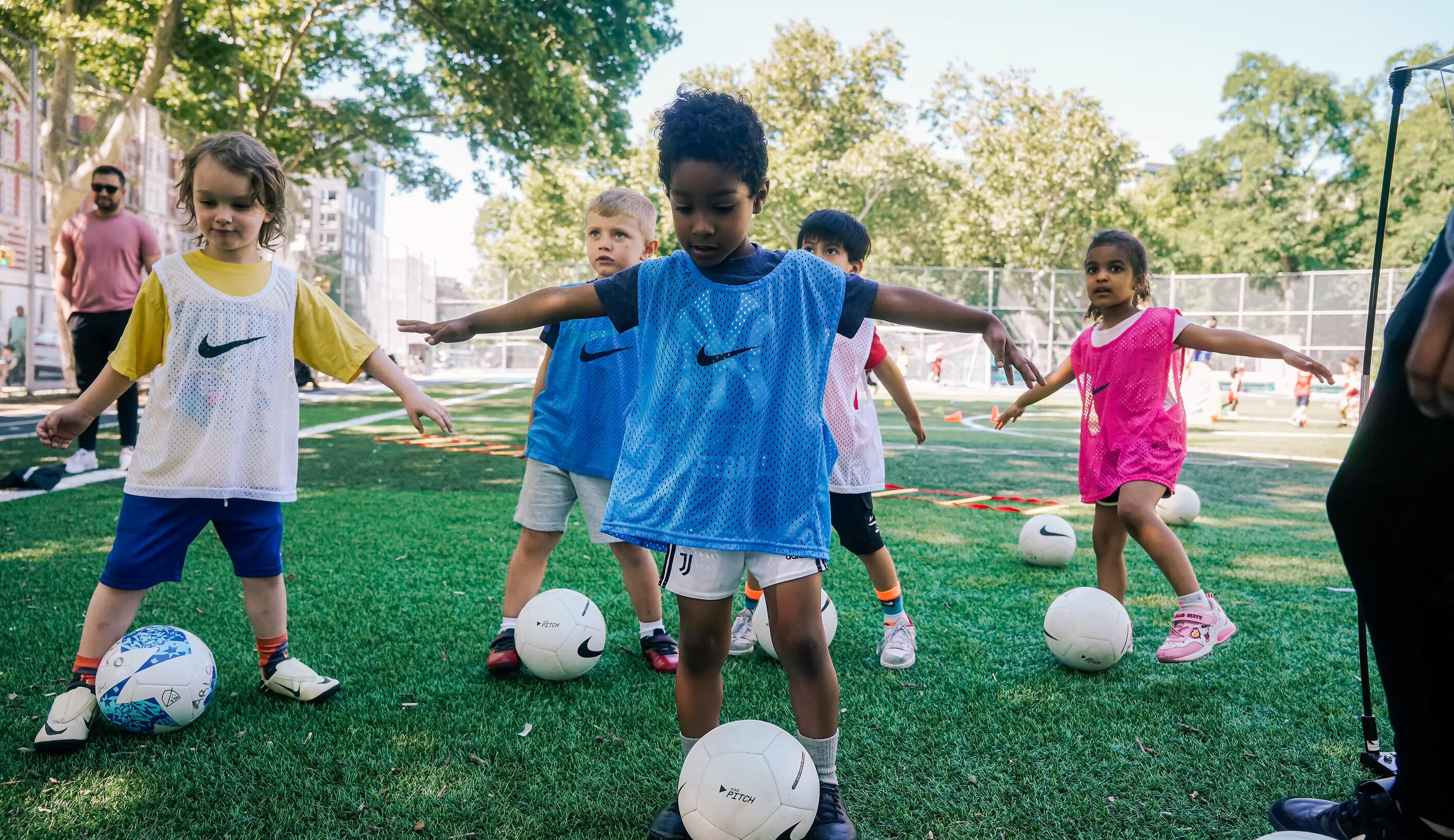
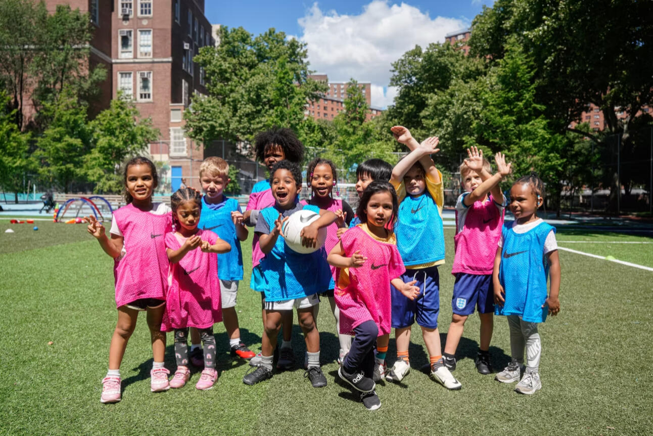
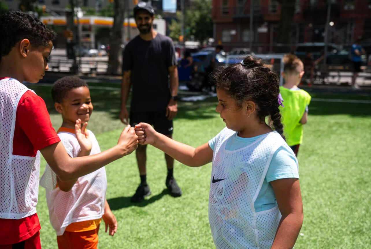
At Manhattan Football Club, I built systems that made the game more accessible; from writing grant proposals and forging community partnerships to development of Footy Flyers, a free program introducing 200+ NYC youth to soccer.
The Challenge: Pay-to-Play
Youth soccer in NYC, and the country at large, remains largely pay-to-play, excluding thousands of kids from underserved communities. Manhattan FC wanted to change that.
My Role
I led strategic planning and execution for community programs, partnerships, and youth development pathways.
Key Initiatives
• Footy Flyers: Founded and named this free weekend soccer program, introducing the game to hundreds of local youth.• Grant Development: Authored over $1.5M in grant proposals to fund youth access initiatives.• Mini-Pitch Projects: Partnered with U.S. Soccer Foundation and local officials to develop new urban play spaces in Harlem.• ManhattanFC App: Advised on design and launch of an internal app connecting player members and pickup games.• Partnerships: Secured alliances with SoccerPost, local schools, and community centers.• Operational Strategy: Built logistics systems for Women’s Amateur and Youth teams, optimizing scheduling, referees, and payments.

Impact
• Expanded access to free programming for underserved youth.• Streamlined club operations and communications.• Strengthened community engagement and brand identity.• Helped position Manhattan FC as a leader in equitable player and community development in NYC.


Building Culture, Visibility, and Growth in One of NYC’s Premier Youth Soccer Clubs
Director of Marketing & Girls Program Coach
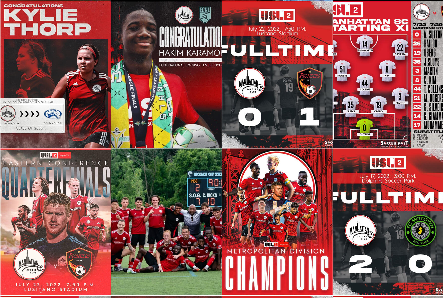
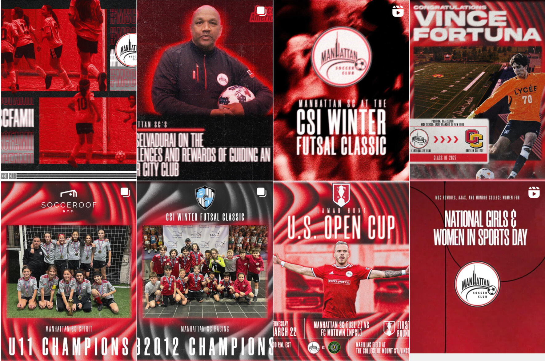
At MSC, I learned how to merge design thinking with coaching — building not just teams, but systems of engagement. Every campaign, practice, and message carried the same intent: empower players, families, and staff to feel part of something bigger.
The Challenge
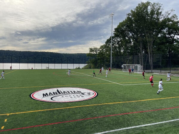
Manhattan Soccer Club, one of New York City’s largest youth soccer organizations, wanted to strengthen its girls’ program and modernize its communication and brand presence to better align with the energy and excellence of its players and coaching staff.
My Role
As Director of Marketing and Girls Program Coach, I worked across departments — coaching, operations, and executive leadership — to build player pipelines, enhance donor engagement, and amplify brand visibility through strategic storytelling and digital design.
Key Contributions
Brand & Marketing Strategy:
• Increased Instagram engagement by 900%, boosted video views by 566%, and grew followers by 60%.• Developed and implemented the club’s first content calendar and social strategy to showcase players and community stories.Program Development:
• Coached U9–U16 girls’ teams, emphasizing skill development, tactical awareness, and leadership.• Built recruitment pathways that strengthened the club’s competitive structure and retention.Donor Relations & Campaigns:• Managed over $500K in capital campaign contributions for the new Marillac Field at the College of Mount Saint Vincent.• Developed personalized donor communication strategies that increased repeat contributions by 20%.Cross-Department Collaboration:• Worked with technical directors and executives to align marketing and program goals.• Presented updates to the board, leveraging insights to adapt communication strategies.
Impact
My work helped reposition MSC’s girls’ program as a competitive and culturally visible force within the NYC and US youth soccer landscape.The club gained stronger donor trust, deeper community relationships, and a more cohesive identity that connected players, parents, and leadership under one story: belonging through excellence.
Curriculum Vitae
My work is fueled by curiosity, adaptability, and a commitment to delivering measurable outcomes. In other words, I build things — companies, products, teams, and programs — that connect people, solve real problems, and create lasting impact.Over the past twelve years, I’ve moved fluidly between entertainment, tech, sports, wellness, and law, always at the intersection of strategy and execution. I’ve co-founded and led ADV3NT, a Web3 music tech platform restoring creative and financial control to artists. I’ve helped stand up CelaMza, translating cutting-edge therapeutic science into a commercially viable company aimed at tackling sarcopenia and rare diseases. I’ve run operations, governance, and community growth for Manhattan Football Club and Digiwaxx Media, built winning cultures as Head Coach at The Brearley School, and driven brand growth as Marketing Director at Manhattan Soccer Club. In every case, the common thread has been transforming ideas into operational reality.I thrive in environments where innovation meets structure — whether that’s architecting blockchain-based minting pipelines, negotiating licensing deals with leading pharmaceutical companies, securing championship wins on the field, or scaling digital engagement for thousands of users. So, if you’re building something bold and need a partner who can bridge vision with execution, we should talk!
EXPERIENCE

Co-Founder & Executive Director
CelaMza
Oct 2024 - Present · 1 yr 1 mo
New York, New York

Co-Founder & Product Lead
ADV3NT
Aug 2022 - Nov 2025 · 3 yrs 3 mos
New York, New York, United States

The Brearley School
Aug 2021 - Present · 4 yrs 7 mos
New York, New York
Head Coach - Varsity Soccer
July 2024 - Present · 1 yr 4 mos
Assistant Coach - Varsity Soccer
Aug 2021 - Jun 2024 · 2 yrs 11 mos
Sporting & Community Director
Manhattan Football Club
Mar 2024 - May 2025 · 1 yrs 3 mos
New York, New York

Director of Marketing & Girls Program Coach
Manhattan Soccer Club (MSC)
Feb 2022 - Jan 2023 · 1 yr
New York, New York

Digiwaxx Media
8 yrs 3 mos
New York, New York
Senior Product Manager
Aug 2021 - Jun 2022 · 1 yr 6 mos
UX Program Manager
Nov 2019 - Dec 2020 · 1 yr 2 mos
UX Designer & Product Strategist
Aug 2015 - Nov 2019 · 4 yrs 4 mos
Business Development Representative
Apr 2014 - Aug 2015 · 1 yr 5 mos

Paralegal & Business Operations Manager
Apprenticeship
Pappalardo & Pappalardo, LLP
Apr 2014 - Apr 2020 · 6 yrs 1 mo
Greater NYC Area

User Experience Research Intern
Spotify
Aug 2013 - Apr 2014 · 9 mos
New York, New York
EDUCATION

Manhattanville College
Graduation: May 2015
Degree: Bachelor of Arts
Major: Political Science
Minor: Economics & Music Business Managemement
Activities:
• Mens Soccer Program NCAA Division III
• Student Activities Advisory Board
• WMVL Radio Board (Student Member)
Frequently Asked Questions
1. Wait… are you a designer, a product manager, or a coach?
All three. I’ve worn multiple hats across my career — from product design and UX research to brand identity to product management and even soccer coaching at championship level. Each role sharpened different skills: creativity, strategy, leadership, and execution.
2. What kind of work do you specialize in now?
I specialize in product and UX design, brand strategy, and creative direction — especially at the intersection of music, sports, and tech. My focus is building products and brands that are both culturally resonant and user-centered.
3. How does your experience in soccer tie into design and product work?
Coaching soccer taught me the same fundamentals as product leadership: strategy, iteration, teamwork, and communication. On the pitch or in a design sprint, the principles are the same — clarity of vision, adaptability, and empowering people to succeed.
4. What’s ADV3NT?
ADV3NT is a Web3 music-tech platform I co-founded to give artists and fans true ownership of music through Bitcoin Ordinals and collectibles. I led product strategy, UX, payments infrastructure, and brand identity.
5. What’s the story behind WVE Media?
WVE Media is a music-marketing agency where I served as freelance brand, UX, and web designer. I led a complete rebrand (logo, color palette, typography, website) that positioned them as a sleek, innovative agency trusted by big clients.
6. What about Digiwaxx?
At Digiwaxx, I began as a Business Development Representative, but my design aptitude and prior UX research internship at Spotify enabled me to transition into a UX Designer role. I was later promoted to UX Program Manager and then Senior Product Manager for their 20+ year-old DJ record pool. Following a site migration that caused 33% attrition, I led a full redesign that reduced attrition to 5% within nine months.
7. What was Ferry?
Ferry was a loyalty rewards app, based in Chennai, India, for restaurants, salons, and entertainment venues in Chennai (discontinued in 2019). As a freelance UX Designer, I helped research, prototype, and launch the app, shaping its evolution into a reward-first platform with loyalty cards, instant rewards, and gamified spend meters. We onbaorded 100K users in the first 45 days.
8. How did you end up doing an apprenticeship with Pappalardo & Pappalardo while also working with Digiwaxx?
I apprenticed under Gary A. Jenkins, Esq. at Pappalardo & Pappalardo, who also served as general counsel for Digiwaxx. Early on, Digiwaxx became one of the clients I managed — handling contracts, negotiations, and paperwork on behalf of our counsel, from employee agreements to royalty negotiations with record labels.Because of my background in music and my internship at Spotify, I quickly connected with Digiwaxx CEO, Corey Llewellyn. During one meeting, I pitched a new service idea: leveraging DJ feedback data from Digiwaxx’s record pool and turning it into a follow-up and relationship-building tool for artists and labels. This grassroots approach helped secure DJ support and build momentum for client releases. It was a success, and I was offered a role as a Business Development Representative at Digiwaxx.From there, I balanced both worlds — continuing my apprenticeship at Pappalardo under Jenkins while working at Digiwaxx, one of the industry’s top boutique music marketing agencies. They were long days and late nights, but it was the perfect start to my career and fusion of my passions for music, law, and impact.
9. What kind of projects/companies excite you the most?
Projects and organizations where creativity meets systems-building: designing brands, building digital products, or coaching/leading communities. I’m most energized by challenges that need both vision and execution and supported by passionate individuals.
10. Are you open to collaborations or new roles?
Yes — with the right people and organization. If you’re working on something that blends tech, music, sports, or culture, I’m interested. Contact me here.


